PLANTCON
GOALS
PantCon is an immersive weekend experience that allows plant lovers from all over to meet and get to know one another. PlantCon Dallas features a 150+ booth plant market with sellers from around the globe, seminars, and workshops from field experts, and exhibitions from the plant world’s leading brands. This event is inclusive of all national and international plant organizations and provides them with free spaces to help spread their missions.
The goal was to develop expressive typography that visually interprets an event. The typography serves as a brand used in design systems across marketing materials.
The goal was to develop expressive typography that visually interprets an event. The typography serves as a brand used in design systems across marketing materials.
CHALLENGES
One of the main challenges was translating abstract type into a clear, cohesive brand. I also had to balance making the design visually bold while keeping it functional and the system remaining cohesive across all deliverables.
PROCESS
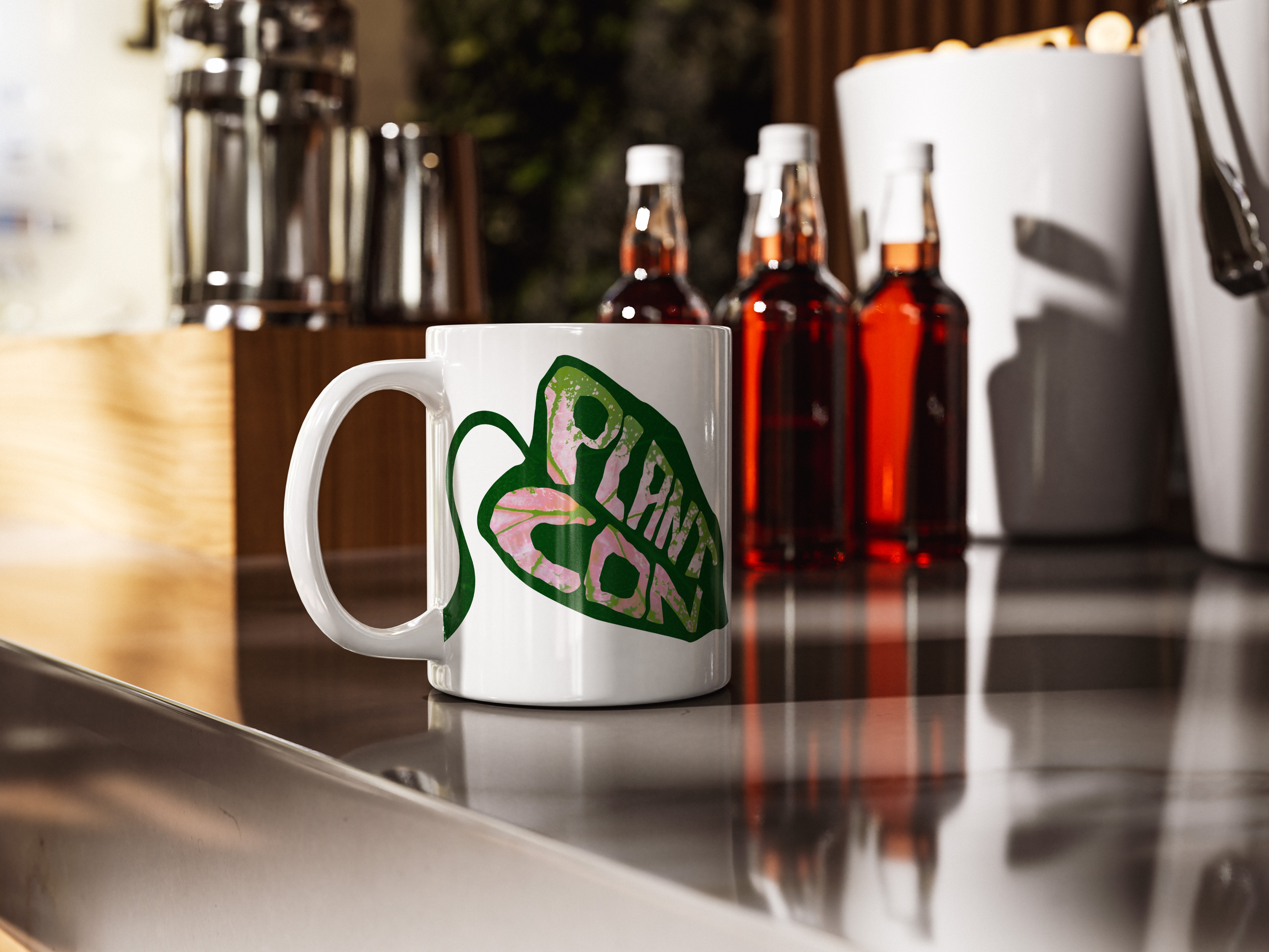
I began by creating an identity for the convention. I hand drew and lettered a leaf and letterforms and brought that into illustrator to continue modifying the shapes. I ended up focusing on a Pink and Green leaf to tie in more color and add some contrast to the branding.
RESULT
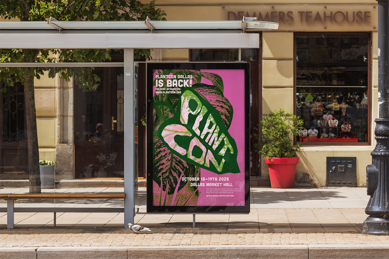
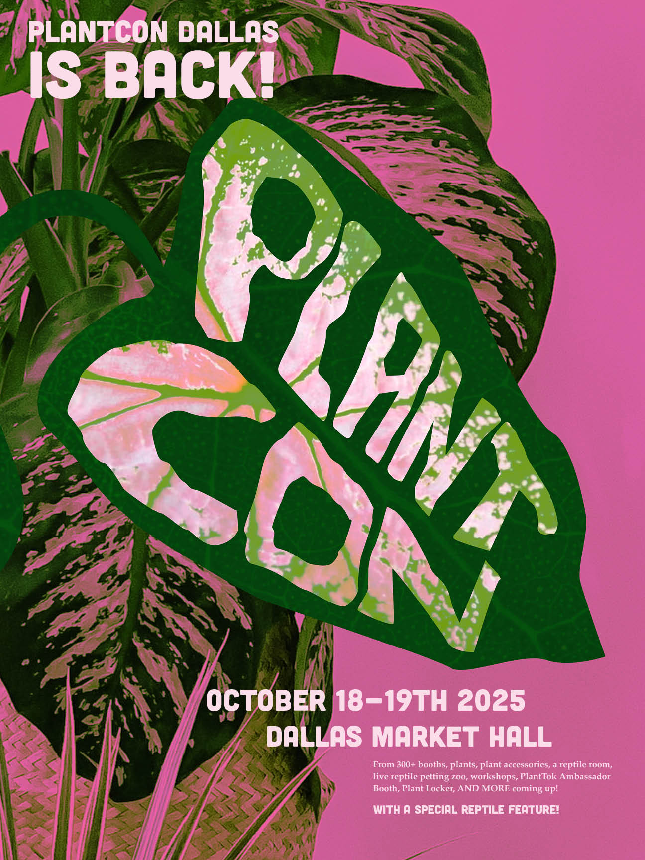
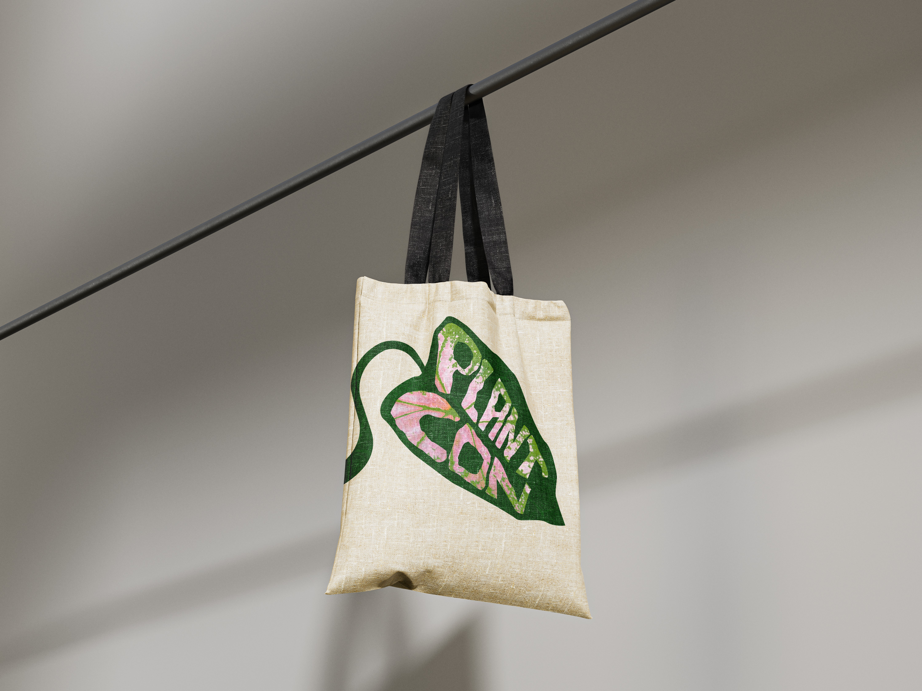
The rebrand of PlantCon Dallas resulted in a more cohesive and recognizable visual identity that better reflects the energy and community of the event. The updated system improved clarity across the physical brochure and poster making the brand feel more engaging and exciting for future conventions.